
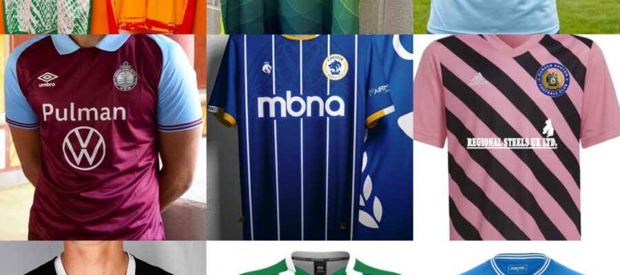
Researching these has been a bit of a ball ache in all honestly. Seriously if anyone from the clubs on the lower end of the scale here reads this, seriously do yourselves a favour and STOP buying shit off the peg gear from shite brands. I’ve honestly seen Sunday League teams around here with better shirts. On top of that, put some effort into your promo shoots for the love of fuck.
Anyway, on with the show.
24th – Peterborough Sports

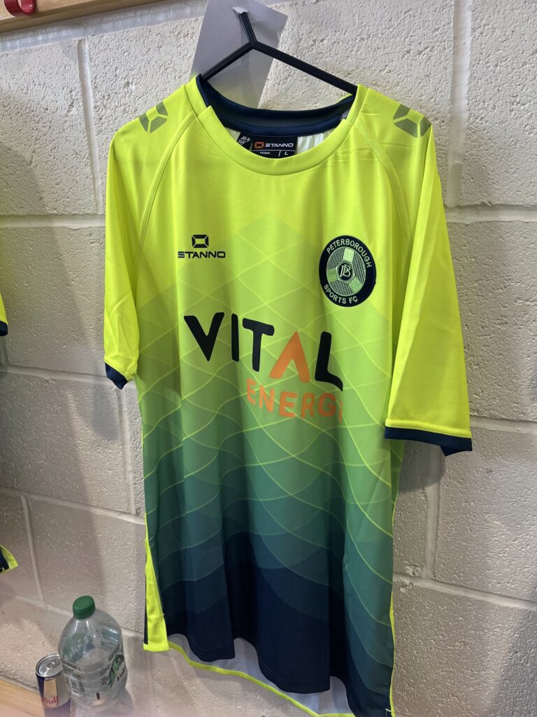
Not only are both these kits utterly shite, Peterborough have actually binned off their traditional blue colours in favour of this weird orange colour, seemingly as part of some sponsorship deal. They haven’t even bothered to put out a proper press release surrounding the new kit/colours that’s given a proper explanation behind the move. Just a comment of ‘It was explained at the forum’.
What makes it worse is that these are just off the peg from a shitey cheap brand. Don’t get me wrong some off the peg kits can look okay but these are just lazy.
23rd – Curzon Ashton
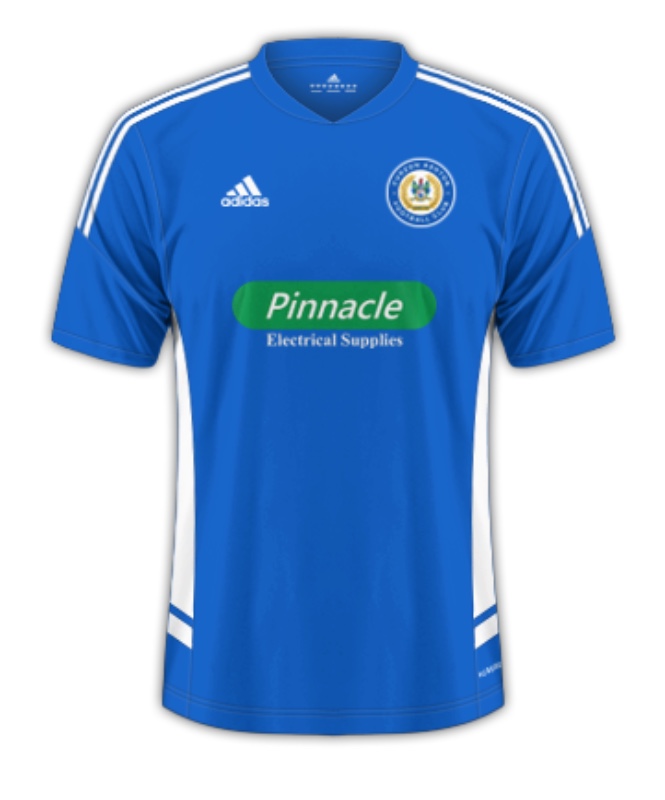
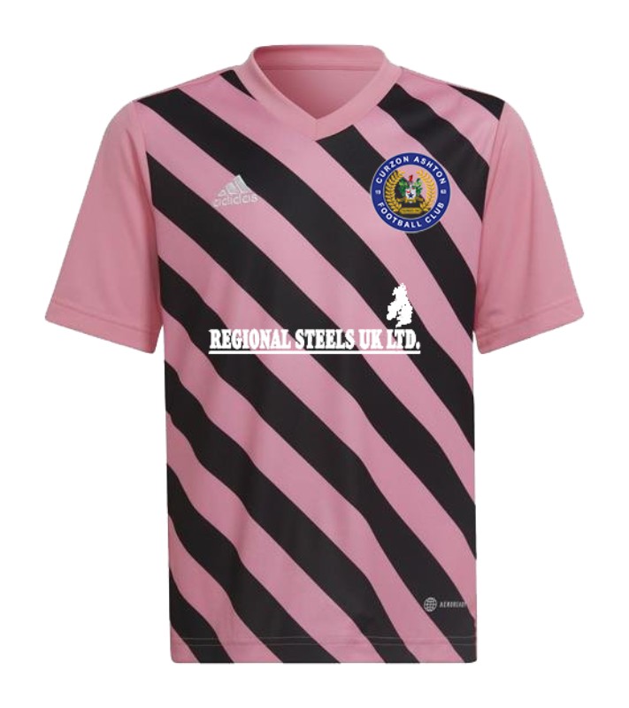
First roadblock here, as these haven’t announced anything about a new kit ahead of this season an as it’s now August, we’ll have to assume that they’re rolling with last seasons kit once again.
While the home kit is just a generic Adidas shirt that looks okay bar the sponsor which doesn’t exactly blend in on the shirt, that away kit is a FUCKING ABOMINATION. Just looking at it makes me feel genuinely sick. Whoever thought ‘ohh aye that’ll lack canny’ must be fucking blind. You can barely even make out the sponsor on it as well but that’s the least of its concerns. Get in the fucking bin.
22nd – Bishop Stortford


Once again, we have another generic set of kits that are being reused from last season. With them being Macron (cheap) and so beyond generic that even looking at them just bores me to tears, only Curzon’s horror of an away shirt keeps them away from 23rd spot. I don’t have anything else to say on these really, as they are just that fucking boring.
21st – Kings Lynn
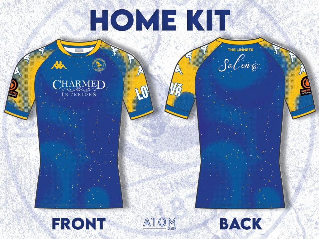
Honestly, who the fuck thought these were a good idea?
The home kit looks like someone’s gotten pissed and flicked a paint brush about a few times and thought ‘that’ll de’ and the away… I’m not sure I really have the words. If it didn’t have those weird blue… whatever the fuck those are meant to be, it might look respectable but looking at that away kit just makes me ill though, I do have a feeling that these might look better in person but for now, they can fuck off.
20th – Alfreton Town
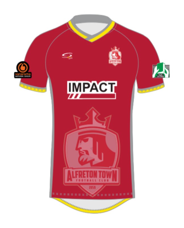

What is it with these having the logo blared across every kit they have? It looks absolutely twatful. These used to actually make a decent effort when it came to kits but these are just lazy, cheap and generic looking kits. Tried to have a look on the club website/shop for a better image but as these are ran like a Sunday league club, this wasn’t possible. A shocking pair of kits.
19th – Warrington Town
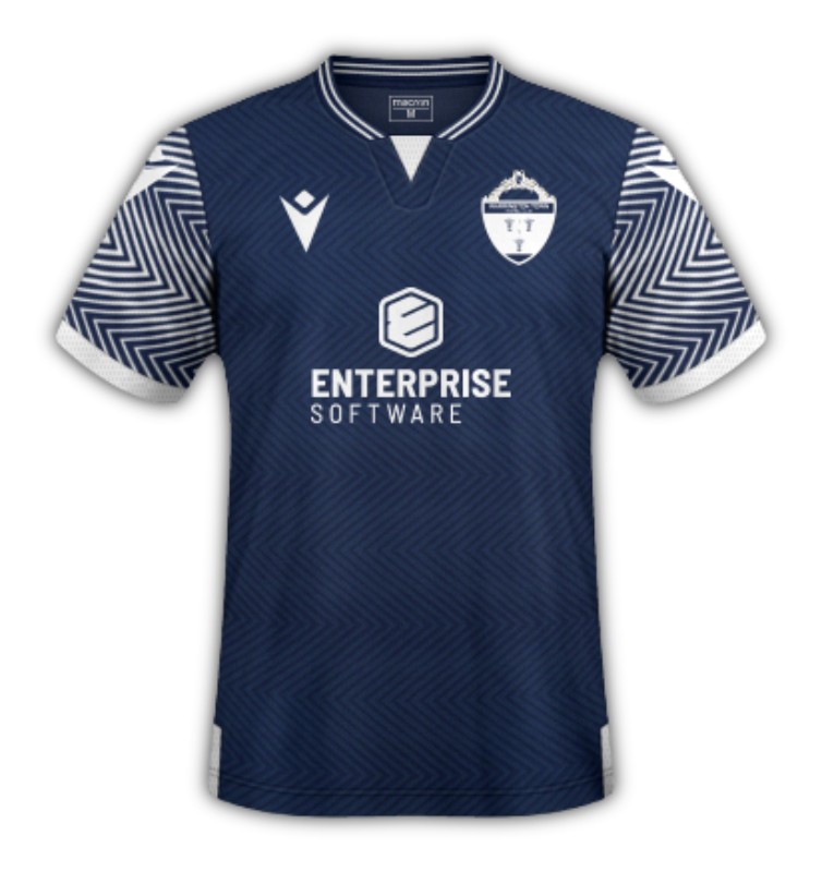
Now yes, I am aware that Warrington’s home kit is exactly the same as Stortford’s away kit, Warrington get a slight pass as their away kit is actually alright and kinda suites the weird lines/shapes on the sleeve. Also because Bishop Stortford are wingey cunts as well.
Seriously though lads, you’re going into a new season season in a new league for the first time with last years generic Macron shirts? Do better lads.
18th – Farsley Celtic
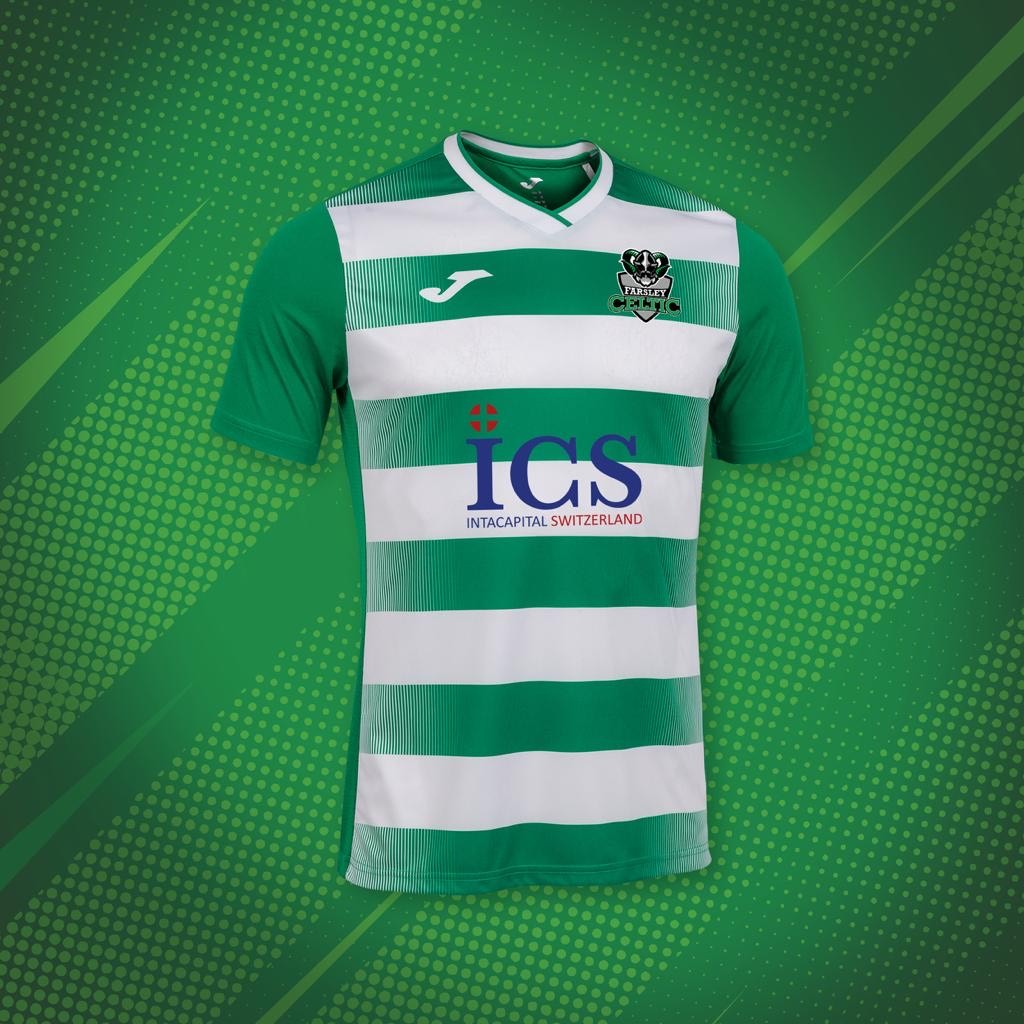

I will give Farsley some credit, at least they’ve tried this year a little bit more than the last 3/4 years when they just had off the peg Puma shirts with just a club crest on that you could have easily ordered yourself for half the price. They’ve now moved onto generic Joma kits! At least they look better, though they are still again, very generic but don’t really fall into the ‘WHAT THE FUCKING HELL IS THAT’ category. For some reason that away feels like it would suite Darlington a bit more though.
17th – Southport


Firstly, what’s with using the bloke with the horses cock to advertise the away shirt?
Anyway back in the day Southport used to make some canny kits with the home kit being a lot brighter, but this dark mustardy yellow kit just looks a bit shit. The dots for stripes look kinda shit as well. As for the away kit, the red sponsor looks very out of place and doesn’t look great, nor do the white shorts. Feel like these can do a lot better than this.
16th – Rushall Olympic

Here we have yet another new team going into a new league with some generic(ish) looking shirts from last season, hooray. That being said, these are Hummel kits though so they get a massive pass for me. The home kit looks canny, and if they had a slightly better away kit they’d be a bit higher up.
For me that crest on away kit stands out a bit too much and just annoys the fuck out of me. A different colour badge that blends in with the colours of the kit would be sound.
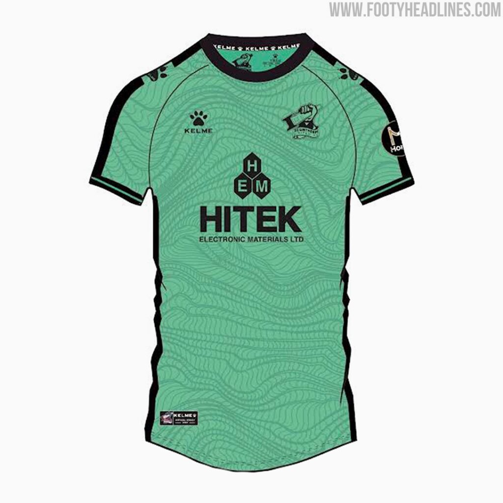
15th – Scunthorpe United
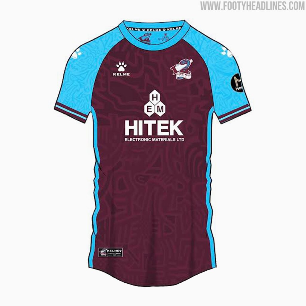

Apologies for the shit images, but these are as good as I can get. One big downfall for these shirts is the weird sponsor logo that looks like a very small dick on tha chests. Other than that the home kit looks canny enough and the third kit looks good in the 3D design, but I’ve a feeling it’ll look much better in the person.
Less said about the away kit though, that kit manufactures logo on all those shirts. Looks like it was designed by a child.
14th – Chorley

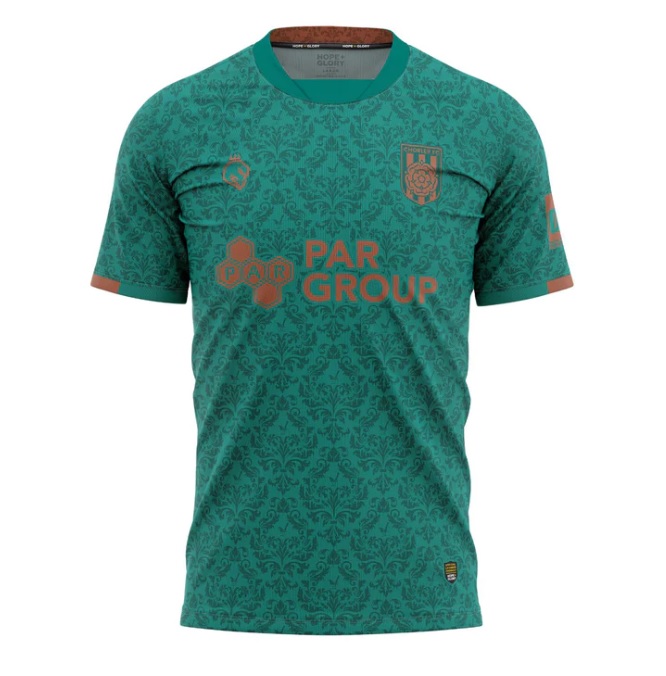

Seriously though, fuck these lot. Who waits until 3 days before the season is out to launch an entire new range of kits? Originally they were going to feature a bit higher up but for for their lateness and the fact that the home shirt is slighly worse than last year, and the away kit is a bit ‘Too Jazzy’ for my liking but again, this one might look a lot better IRL.
13th – Buxton

So, I don’t quite know what these fuckwits are up to. They’ve announced that they’re having a vote to choose an away kit, but I don’t believe they’ve announced a winner?
Anyway, the kits are last years but still, they still hold up compared to a lot of the dross we’ve seen above. Home kit is very smart and it’s from Canterbury who make decent stuff, though not usually for football.
12th – Darlington 1883


As ever, since reforming in 2012 Darlington remain uncreative and off the peg when it comes to kits. While the home kit isn’t all that bad, the shitey sponsor ruins it for me as the logo just doesn’t seem to really fit plus, you can barely make out whatever the bottom line is supposed to be. The colour of the away kit is canny, and the sponsor only spoils it a little bit.
11th – Brackley Town

For the love of fuck lads in future, please take some better promo shots. Having to scroll through your twitter page to find a decent face on image of someone wearing your home kit isn’t the one.
Anyway, while these aren’t all that exciting and perhaps a but uncreative, the do look very smart and clean cut. Brackley have always played it safe with kits at this level of football and Puma are a canny enough brand. While these shirts are nice, they’re not all that exciting.
10th – Tamworth

In my original draft I had these a lot higher, and I’ve fucking ne idea why. When it comes to the online store, website and communicating clearly on social media, Tamworth are a wee bit shite so it’s been hard to get decent images of the their kits.
The home kit is a brand new one, and Kappa have done well here. The design across the shirt looks canny and I suspect it’ll look even better in person. The away shirt is carried over from last year, and while the colour is okay, I’m not a fan of the weird stripes.
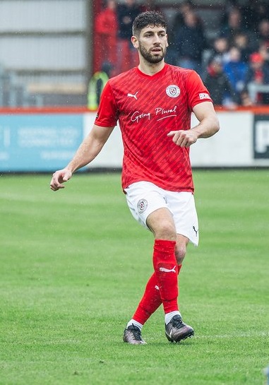
9th – Spennymoor Town
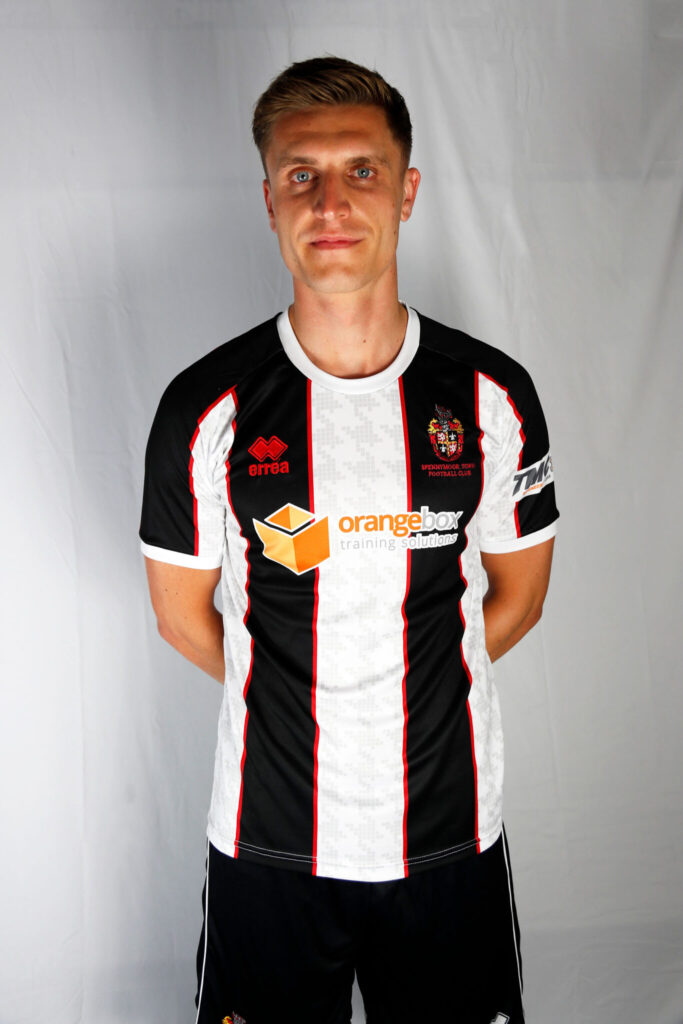

Spenny’s home kit this year is almost great. I love the red in between the stripes and the patterns in across the white stripes look canny, but again it’s one where the sponsor massively kill it. Firstly, it looks shite. It doesn’t fit in with the kit at all, and you’ll barely be able to make it out on the pitch. Simplify your logo for a football shirt.
As for the away shirt, I’m a fan again and although the sponsor hurts it again, it’s a bit more visible here than on the home kit.
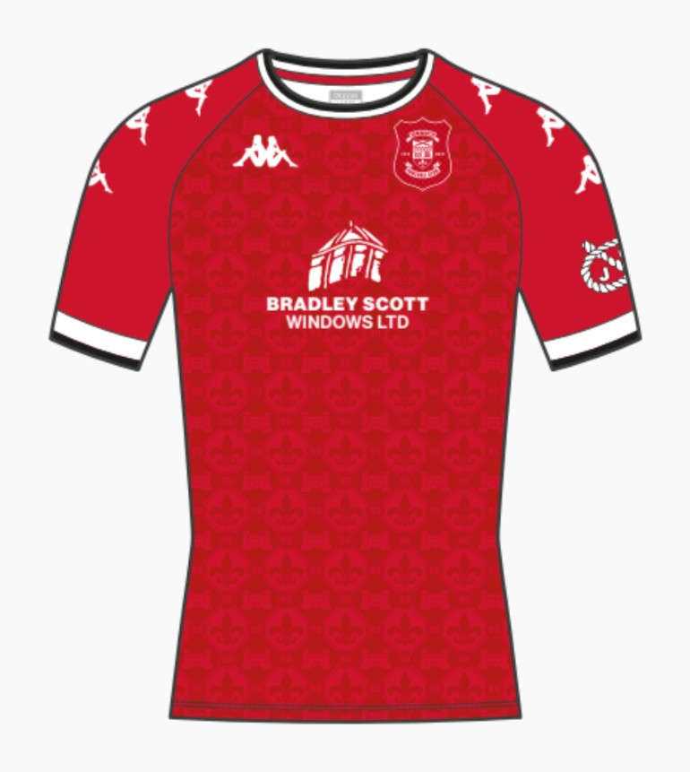
8th – Hereford
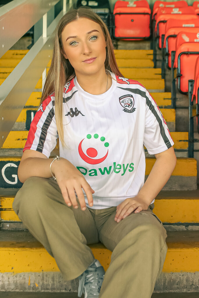

Firstly, if anyone has this lasses number, Mr Jack Morton would like the deets ASAP please.
Anyway, I’m a big fan of Kappa’s new home design here. The red on the sleeves is a bit different but fits in perfectly, as does the massive sponsor on the front. It’s hard to fuck these sort of shirts up as Hereford are usually very basic and plain, but they’ve done well here. The away kit is carried over from last season and while im not a fan of the fake button colour shirts, it does the job.
7th – Banbury United
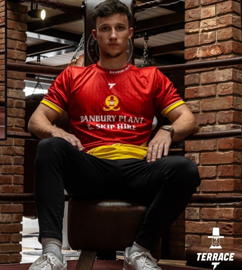

So this is where things will get a bit disagreeable, but bare with me. As for these kits (despite the weird promo shots) I’m actually a big fan. I think the central logo fits in really well as does the sponsors, and clearly some effort has been put in to this kits by the manufacturer/designer. The home shirt is smart but that away shirt looks superb. The collar is a great touch as well.
6th – Gloucester City

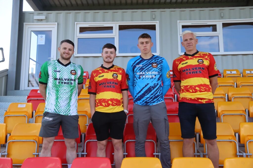
For some these may be a bit too jazzy and despite the fact they’ve been manufactured by EV2, these are absolutely class. Great personalisation to make these a bit different from previous years kits, and that away shirt gives me Nigeria 2018 vibes. Probably a bit marmite with anyone over the age of 40 though.
5th – Blyth Spartans


Am I being a bit bias here? Absolutely not.
While at first the different shapes and sizes of the Spartans helmets REALLY got on my tit end, having seen them in person I’m actually not that bothered by them anymore. Some may be bored with Errea and I can totally understand why, but I was a huge fan of last seasons home shirt and this one isn’t all that far off.
As for the away kit, I was far from a fan of last seasons so this is an improvement. At first I wasn’t so sure on it, but it looks much better in person and seems to have sold really well. Top work here.
4th – Scarbados


Don’t get me wrong, it’s really hard to fuck up these kits but still, Scarborough and Adidas seem to smash these out the park every time. First of, Adidas are just class and you can just about never go wrong with them. While the designs here are subtle, they’re done really well and look really good. Hats off to these lads, these are class.
3rd – South Shields
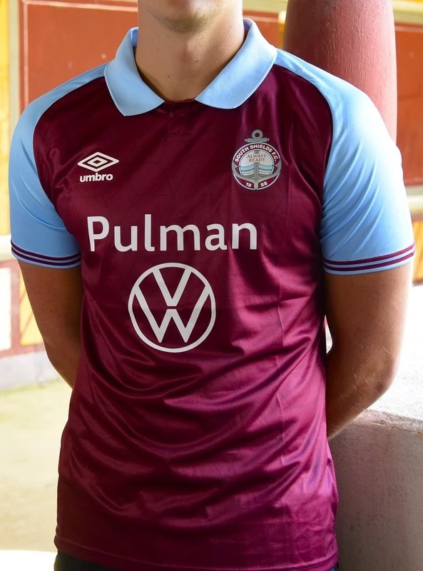
For some reason Shields left it until 2 days before the season got underway to unveil an away kit which is odd. Anyway, that home kit is just absolutely sublime. Umbro have absolutely smashed it this summer, especially here.
The away kit caused a headache, as it’s far off the home shirt and the bottom part of the sponsor looks like something Elon Musk has spunked out. Also not a fan of the weird colour, but it’s a decent collar and with the home shirt carrying it, 3rd place is surely fair for the Diet Mackems.
2nd – Chester City
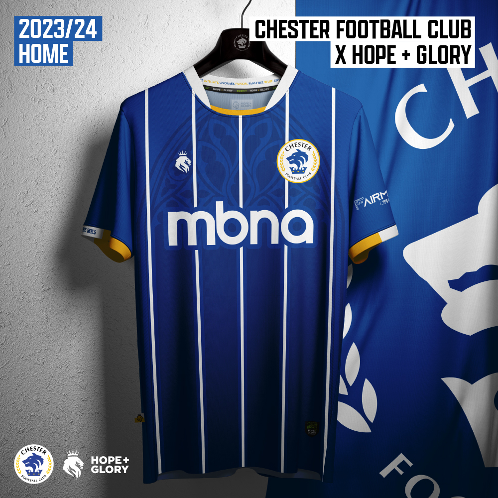
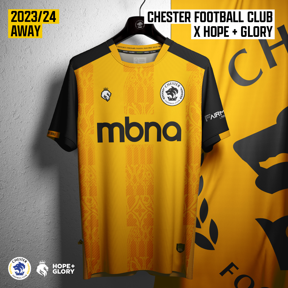
These just don’t miss. Consonantly one the best kits in the league year on year, and this year is just more of the same. Clean designs with some great nods to local history in them, Chester and whoever the fuck Hope and Glory are have done brilliantly here, nothing more to add.
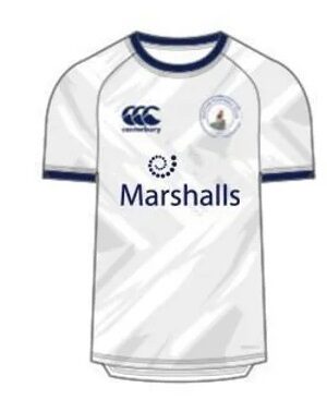
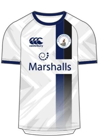
1st – Boston United


Sheer brilliance here. Boston and Umbro have probably produced one of the nicest set of kits in the country here with this pair of retro style kits that have gone down really well online. If you can’t vibe with that away kit, then you’re an uncultured swine.
From stuff I’ve read online these have sold ‘extremely well’ by Boston’s standards, and im not surprised at all.