
Spartans Trust vice chair Ian Hertwick has been involved with Spartans in one way or another for north of 30 years, serving in various roles.
Recently however, he’s been known as ‘Master of the kits’ to many of us – as the man who’s been behind the design of many of the club’s kits across the last 10 years.
For Ian, the kit designing role began back in 2017 – as he explained “When we ditched EV2, and went back to Errea, they basically said what do want as a kit? I had a moment of inspiration in the middle of the night when I realised it was the 40th Anniversary of the cup run, much to Mrs Hertwick’s annoyance as I woke her up to tell her. It was an obvious design to copy”.
Since then, Herty has gone on to design almost 20 shirts across the last decade – including the 1977/78 anniversary shirt and the 125th anniversary shirt.
However, some of his (or Erreà’s) concept designs over the years have been ‘left on the cutting room floor’ so to speak. Some may have been given serious consideration, others were merely looked at chucked after only a glance! Below though, Ian breaks down some of these ‘concept kit’ idea’s and why they didn’t get the green light.
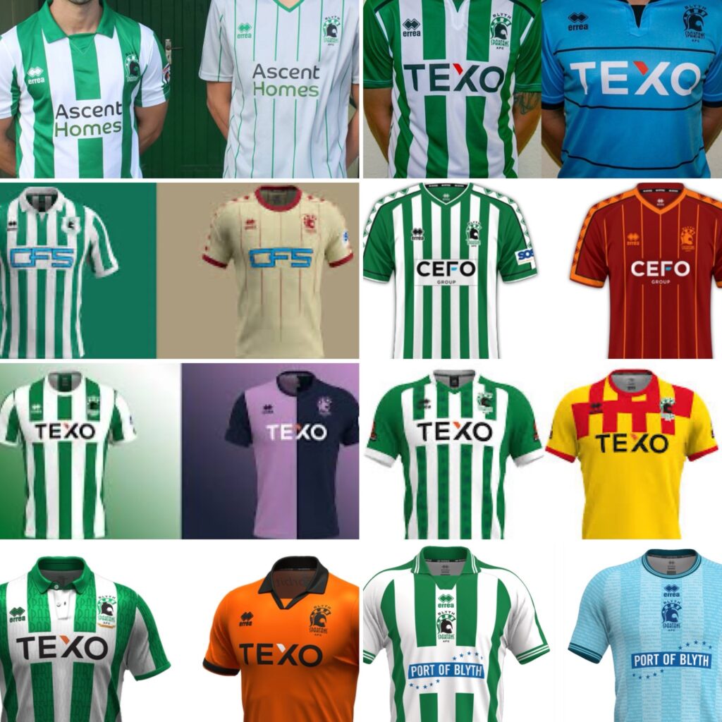
Home – 2021/22
“I wasn’t really in love with this one” he explained. “I asked Errea to come up with something different with the stripes, and this is what they came up with. It’s certainly different, and there’s only so much we can really do with home shirts – but this just wasn’t right for us”. A wise move, in the long run.
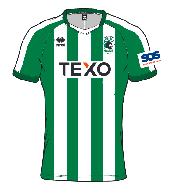
Home – 2024/25
“So this is more of a Greek based design. I quite like this one in truth, and I do tend to holiday in Greece every year!” The second year in a row with the ‘design in the stripe’ as a concept, Ian explained “Again it’s just trying to do something different. The last time we went to Italy to visit Erreà, we saw the Hartlepool United design and we saw the badge/stag sublimated into the design and we thought it was good concept”.
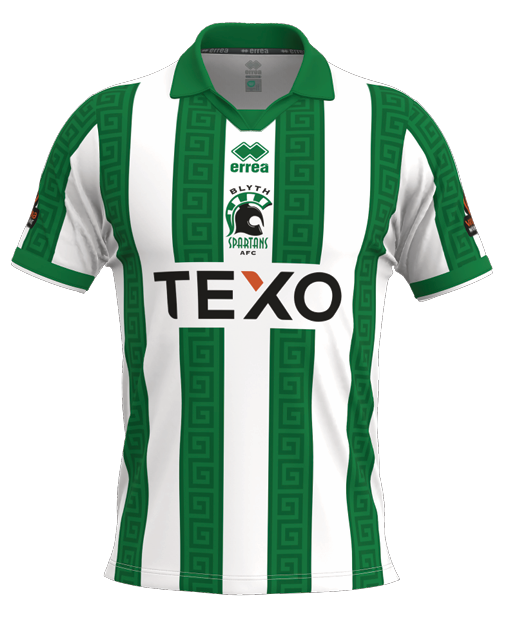
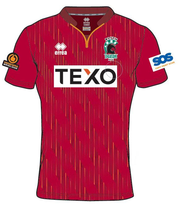
Home – 2022/23
A slightly greener design of the version we actually ended up with, when asked about the variation Ian said “What you’ll find is, you do a green and white shirt and some will say there’s too much green. Some will there’s too much white. You can never please everyone. So that’s why we try and alternate every year, so some years the arms are solid green, some years the arms are stripped. We just try and keep a healthy balance to appease everyone’s taste”.
Away – 2022/23
On how away shirts and designed, Ian explained “For the away kit, I tend to ask them to come up with some different colours and different designs to see what works. I can give them a guide if I have an idea in mind, or if I like a certain design but not the colours, I can get them to swap them out”.
He added “This one does give Middlesbrough away vibes. We couldn’t go for this one due to it having stripes though, because if we play a team in back and white for example, we couldn’t get away with it. Some referees won’t allow a clash of stripes, and you also have to factor in people who are colour blind. Thankfully, I don’t suffer from that!”.
Away – 2023/24
“I think this may have been a concept when we were looking to go back to Northumberland colours” he explained. “Admittedly, this one didn’t get very far”.
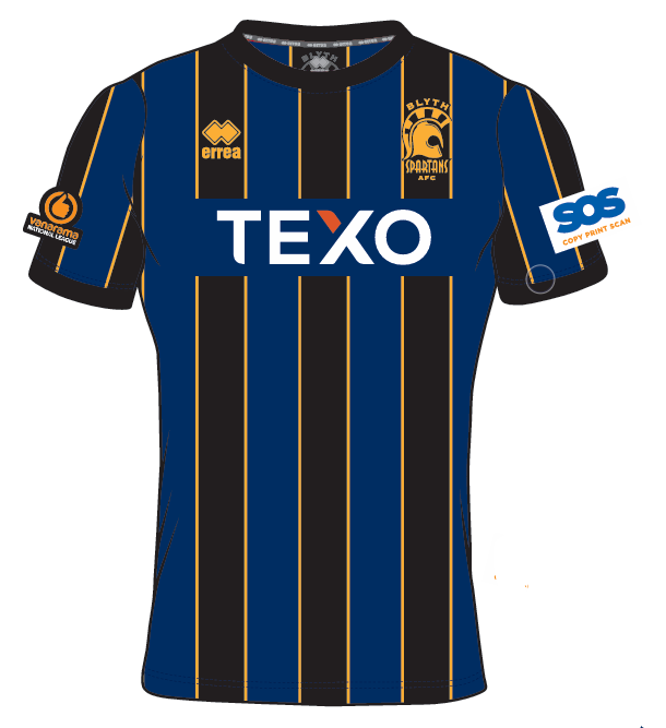
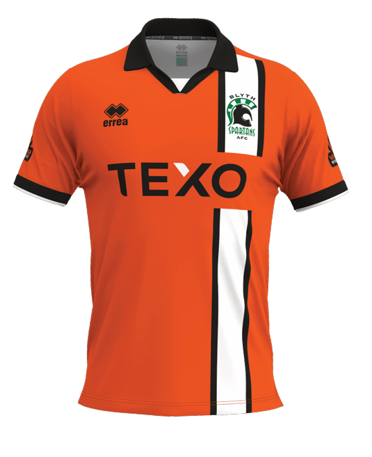
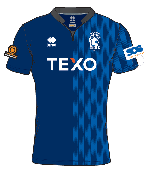
Away – 2022/23
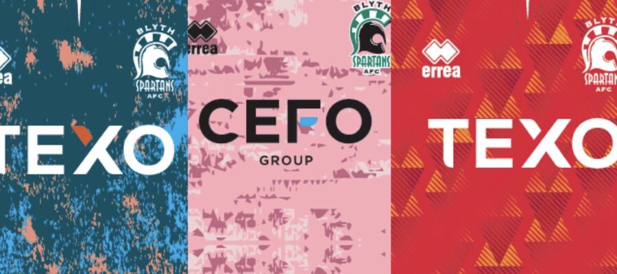
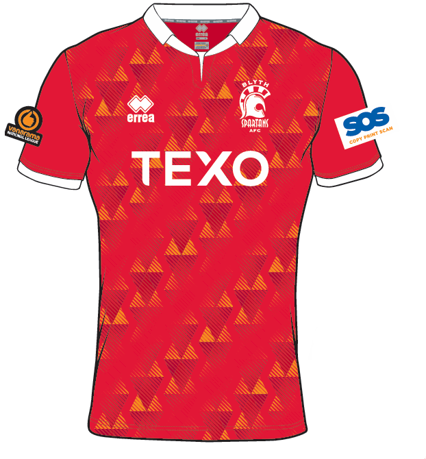
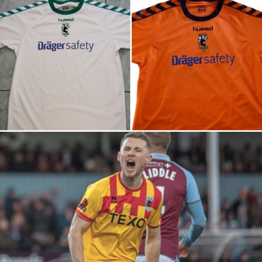
“The Texo logo would have been sublimated in properly” he explained at the start, before adding “It’s not a bad colour, but we have to bare in mind, would a referee allow us to play a team in red and white in that? We always have to navigate a minefield when it comes to colours in that respect”.
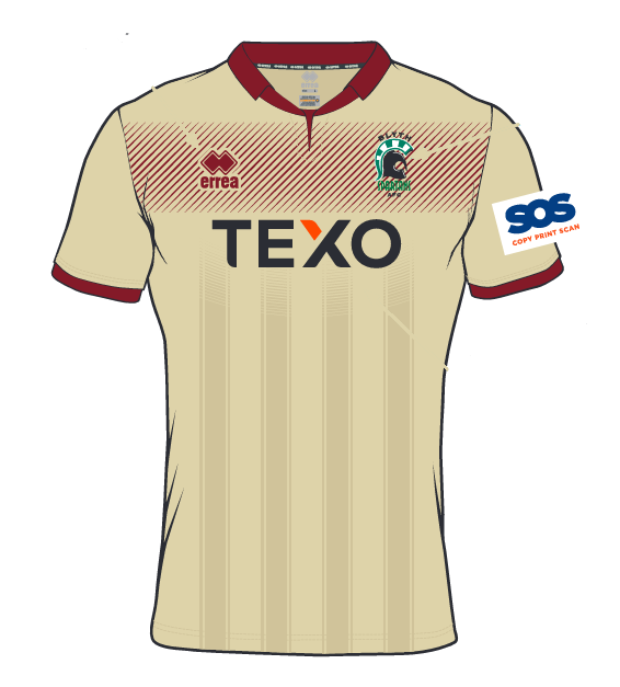
Away – 2020/21
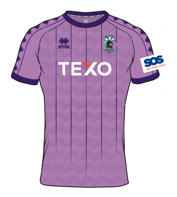
“So with this one I thought the lilac colour would be quite nice. Then they came up with the ecru based design”. So that design ended up being used with the ecru colour for the Covid season (2020/21) and we kept the lilac colour for something up the road”.
Below, you can see one of the original designs in the Ecru colour – and get a rough idea of how the designs were switched around.
Away – 2024/25
A slightly more interesting design from last season, Herty explained “Again we were thinking Texo colours. I agree it does give off ‘Luton Town’ and at the time we had Jon Shaw as manager, and JJ O’Donnell was still featuring for us – so that’s where my thought process was. Obviously the new regime of course went for something different”.
Away – 2022/23
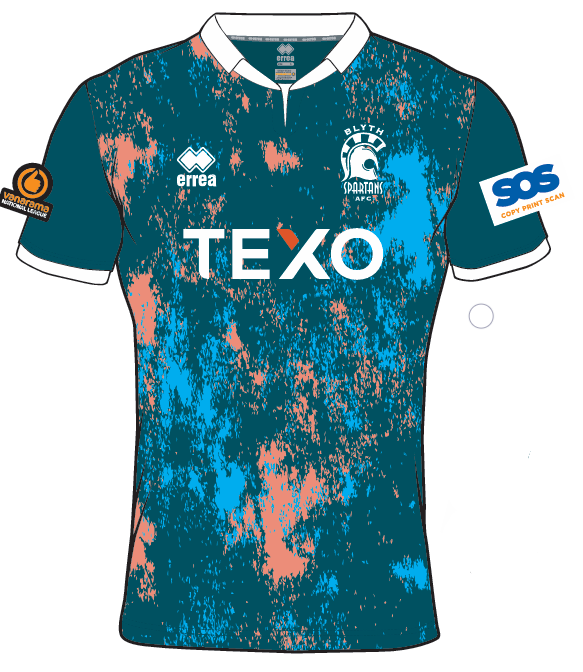
A slightly more experimental style, Ian said “I was quite taken with it first. But it’s just a bit too ‘greeny’ for us really. Again, it’s one where you have to taken into account what a referee would think of it”.
Away – 2023/24
“I liked the colours, but again, I thought it would perhaps be a bit too dark. The two different designs didn’t really fit either” Ian said. “The design on the right might have been okay, but we just didn’t press ahead with it”.
Away – 2022/23
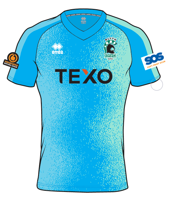
“I thought this was quite a nice one actually. Again I don’t get very far with this one as we had others on the table, but it certainly would have been a different style that we sometimes look for”.
Away – 2021/22
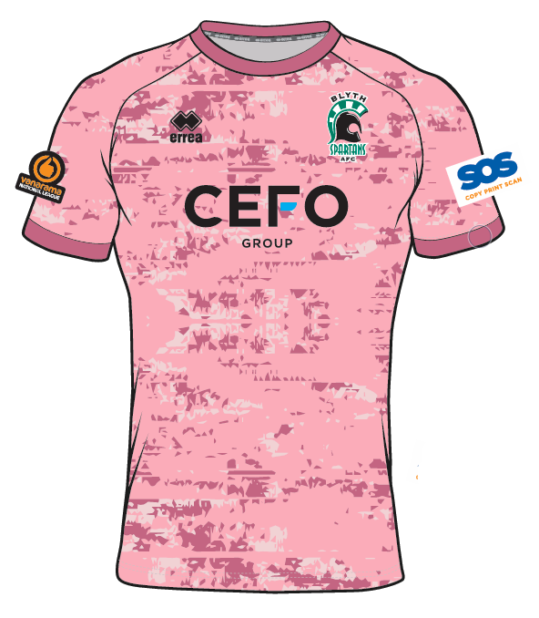
On this final and rather different pink number, Ian said “I quite liked the colour at the time, but the rest of the Supporters Club committee at the time said no. But I thought it was quite different, and again, sometimes we need to look to do that but at the same time, also think about how well it would sell”.
In terms of how designs actually come about and how long it takes a design to be formed and tweaked, Ian said “I usually start about Christmas time, thinking of what we can do, any anniversaries coming up.I do a rough sketch of what I’m after, send it to Erreà design team to make them look better and ask them to come up with their ideas. Then it’s a case of seeing what works and what doesn’t”.
He added “In general, it takes 3 attempts then I just wait to see what sponsor we have, add their logo, make sure they are happy, and then sign off the final design. To get the kit in for pre-season, designs need ideally to be done and signed off by the end of April. As we know, that doesn’t always happen, and it’s a mad last minute rush!”.
When asked about what his idea of a ‘traditional Spartans away kit’ was, Ian said “That’s a difficult one. I would say white or yellow from when I was a kid, but rules change over the years and we can’t really have a prominent white shirt as some referee’s wouldn’t allow it as it might not stand out enough against a team with white stripes. If you look at the Ashington game recently, if we had an all white shirt, it would be difficult to work out who was who. Yellow shirts sometimes don’t sell as well, and we have to think commercially as well as traditional. The Northumberland one worked well as it was unique. We try to get a colour scheme that works well on and off the pitch”.
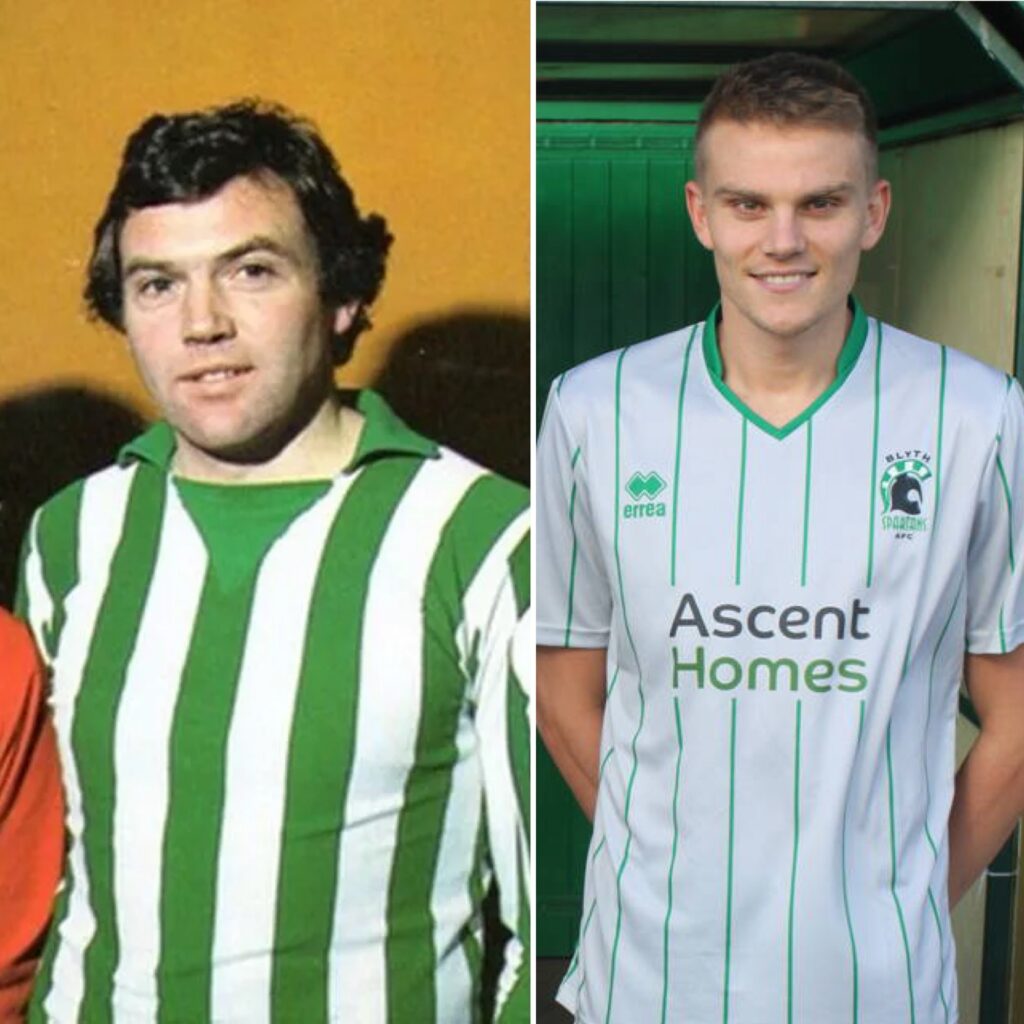
Reflecting on his favourite Spartans kits of all time and of the one’s he done, Ian said “Of all time, it has to be the 77-78 shirt, pre Bukta. It was the first one I had as a kid and was so simple, no sponsors logo. Away shirt I would say the 2017/18 silver one. Very clean looking and different from anything we’ve had before”.
He added “For ones I’ve done, probably the 17/18 home shirt as it was my first one I was involved with. For Away the 23/24 Northumberland one. Again something different that no other club has ever had. Took ages for the Italian designer to understand exactly what I was after, but I think it turned out great.”.
A huge thank you to Ian for sharing his many idea’s and work across the years. Going forward, the Trust will be looking to use supporters feedback and comments to craft both home and away shirts tailored to your requirements. If you wish to have your say, you can leave your feedback and requests for future kit designs here.